Ask most marketing managers what their biggest photography headache is, and nine times out of ten it’s consistency.
Images that don’t quite match across different campaigns. Product shots from three different photographers with three different lighting styles. A brand that looks subtly different on Instagram than it does on the website. It’s one of those things that’s hard to put your finger on, but you know it when you see it — and customers notice, even if they can’t articulate why.
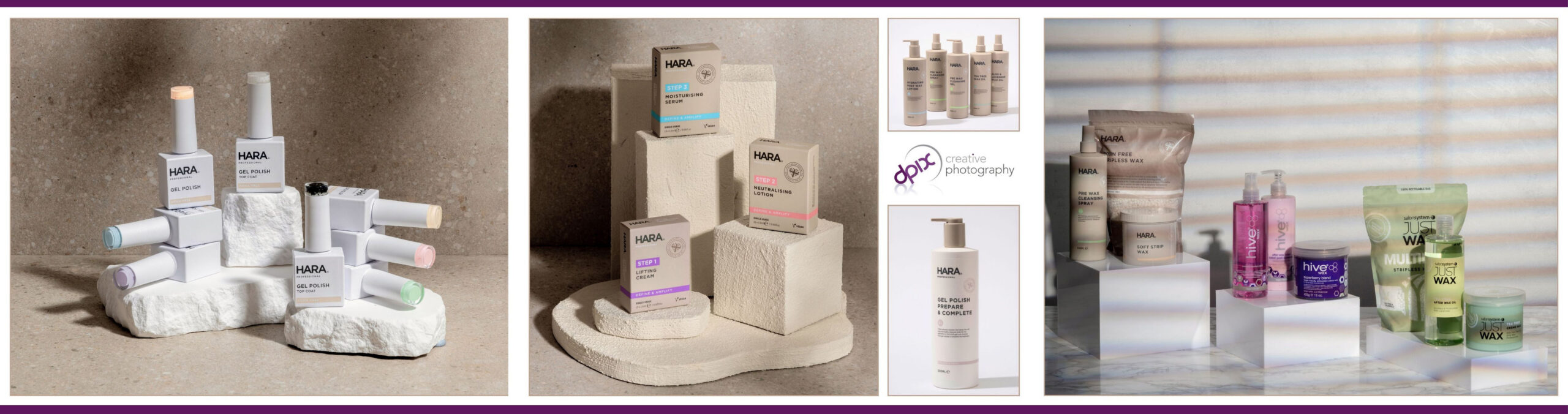
Consistent photography is one of the most powerful and underrated tools in a brand’s arsenal. Here’s what we’ve learned from building long-term client partnerships over 30 years.
Why visual consistency builds trust
When customers see the same visual language repeated across your brand — the same tones, the same quality, the same considered approach — it sends a clear signal: this is a business that has its act together. Consistency communicates professionalism without saying a word.
The reverse is equally true. A product shot with harsh studio lighting sitting next to a softly lit lifestyle image from a different shoot — both technically fine images, but together they undermine each other. The visual disconnect creates a subtle feeling of uncertainty in the viewer, even if they can’t identify exactly what feels off.
What we’ve learned from long-term client partnerships
Some of our most satisfying work comes from clients we’ve worked with over many years. When we know a brand well — its tone, its audience, the kind of detail that matters to its customers — we produce images that feel cohesive without being identical. There’s a visual thread running through everything, even when the brief changes season to season.
We’ve worked with one design-led lifestyle brand for several years now, photographing everything from clean studio product shots to elaborate lifestyle setups featuring their range of stylish home and beauty products. The seasonal brief evolves. The visual identity stays consistent. That consistency has become a genuine competitive advantage for them in a crowded marketplace.
Getting to that point takes time and communication — but once it’s established, shoots become faster, decisions become easier, and the output gets better every time.
Studio and lifestyle: getting the balance right
For most product brands, you need both. Clean studio shots on white or neutral backgrounds for retail, e-commerce and catalogues — clarity and accuracy above everything else. And lifestyle images that show the product in context, helping customers picture it in their own lives.
The two approaches need to feel like they come from the same place, even if they were shot months apart. That takes a proper creative brief and a shared understanding of the brand — but it’s not complicated if you approach it systematically from the start.
What to look for in a photography partner
The relationship matters as much as the technical ability. A photographer who takes the time to understand your brand — really understand it, not just skim the website the morning of the shoot — will produce better work. Someone you can have a frank conversation with about what isn’t quite working. Someone who cares whether the image achieves your commercial objective, not just whether it looks nice in isolation.
We’re based in Bromsgrove and work with brands across the West Midlands and UK-wide. We shoot product, brand and lifestyle photography in studio and on location — and we’re genuinely interested in the long game.
If consistent, high-quality brand photography is something you’re working towards — or if you’re currently working with multiple photographers and feeling the inconsistency — let’s have a conversation. We’d love to hear what you’re trying to build.
To find out more about our commercial photography work, visit our service page.
Related reading: Brand Photography: More Than a Nice Set of Images.
Also worth reading: Lifestyle Photography for a Luxury Care Home Provider.
Free — for marketing teams
Get practical photography tips in your inbox
Join marketing managers and brand teams who get our monthly guide — briefing photographers, planning shoots, getting more from your imagery. No hard sell, no fluff.
